
Marketers know a LOT of people buy wine based on packaging, though most reading this I trust are exempt–myself especially. But there is an example of me buying a wne based almost exclusively on packaging. Nice, conservative front label, containing all the important bits and not extravagant–only simple fonts and motif. Screw-top, of course, but what really caught my eye was the extremely cheap–nearly un-punted–bottle. I had to have it.
Deep, dark, nearly impenetrable ruby, a nose slightly alcoholic, mired in expansive musty earth rather old-world reminiscent with dark fruit verging on burnt. It’s not an incredible wine to smell, but the steely aspects gain many points. Plentiful air settles things down into rather glorious–albeit simple–blackberry and deep cherry.
In the mouth, it’s a rather simple affair, and while we are all accustomed to the obligatory “14-oh” from Australian labels, this feels quite lighter in proof. This feels like a few California producers–like Union Sacre or Broc–trying to bottle a rather un-slutty interpretation of the variety: sticking to acidity and cleanliness over obtuse luxury. Decently fruited, shockingly dry, but still with manageable tannin. The finish is crisp and clean and everything screams a well-made, easily-priced claret.
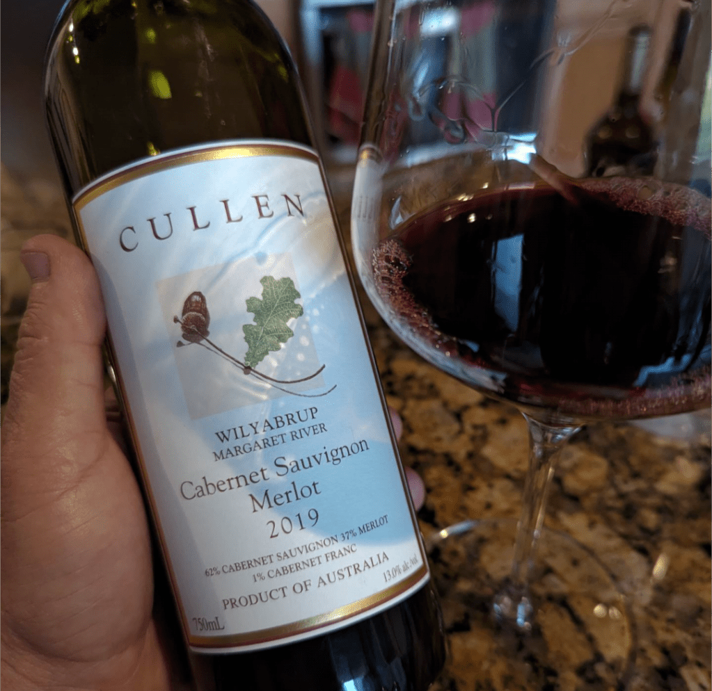
2019 CULLEN Cab/ME/CF 62/37/1 Wilyabrup Margaret River Australia 13.0
